Haksec Group brand
Haksec is a pixel-art brand: one laptop, transmitting. This page is the single source of truth for anyone putting the Haksec Group name in print or on screen, whether that’s press, a partner deck, a conference slide or one of our own companies. Everything here is downloadable, and everything on this page is rendered with the same tokens, fonts and components as the rest of the site.
Logo
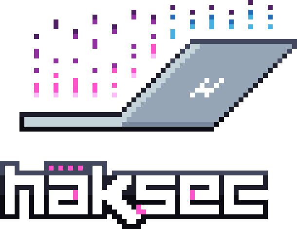
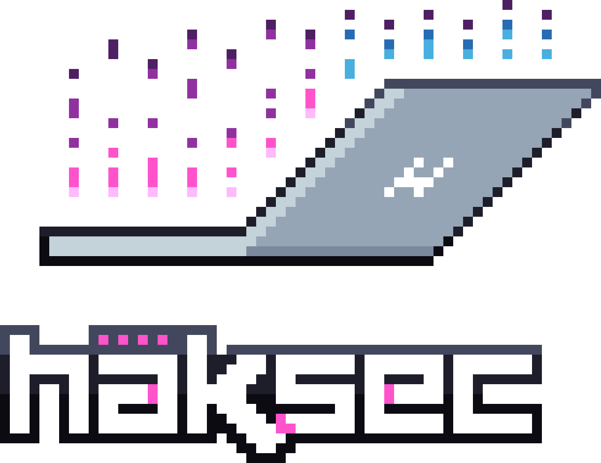
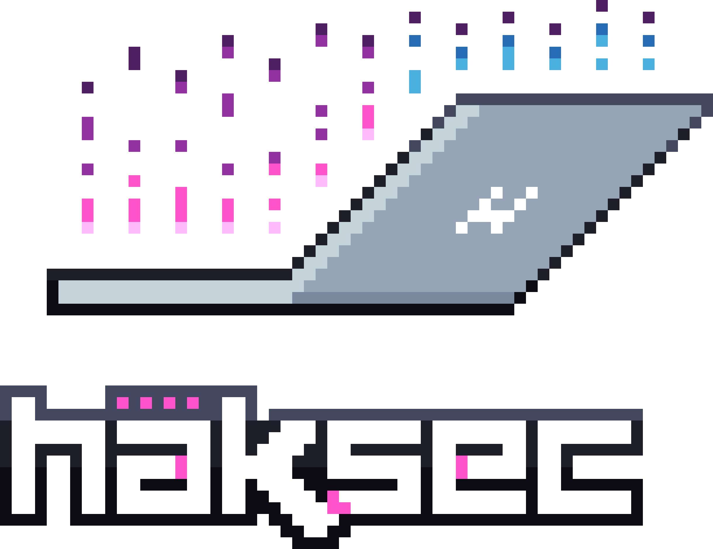
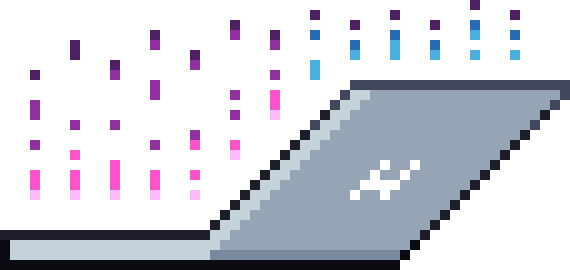
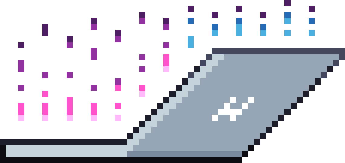
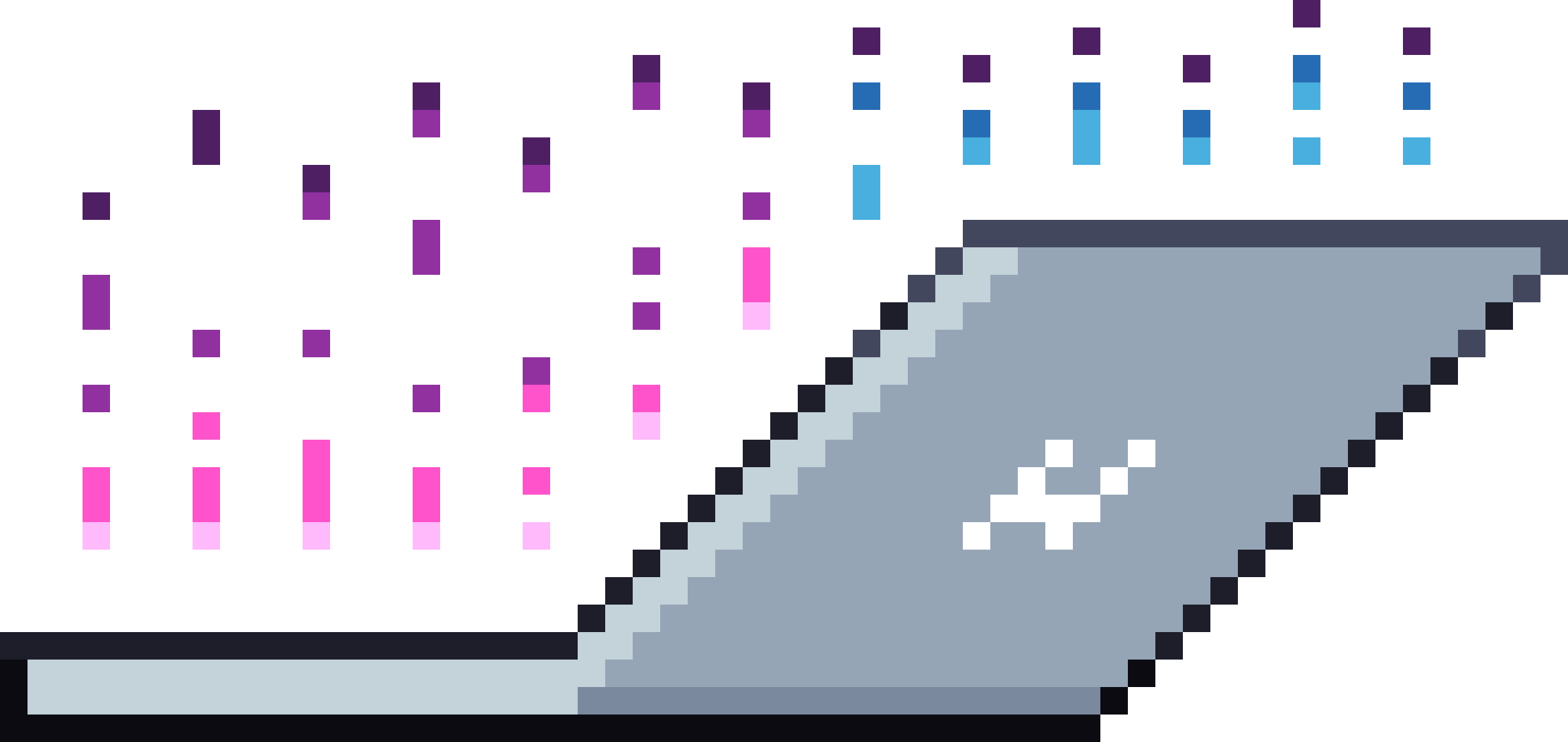
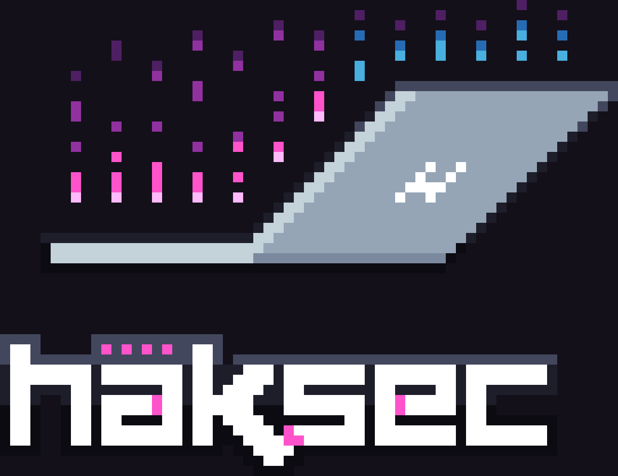
The logo is true pixel art: a 61×47 grid of square cells in 13 flat colours. The SVGs are exact vectorisations of that grid, so they scale to any size without softening. Three forms exist: the full lockup, the laptop mark, and the häksec wordmark. Single-colour versions render the mark as a silhouette and the wordmark as bare letterforms; the H on the laptop screen stays visible in both, black in the white version and cut out in the black version.
























Clear space & minimum size
Keep a margin of at least 4 logo cells (the width of four of its pixels) clear on every side. Render only at whole multiples of the cell grid and keep image-rendering: pixelated on raster renders, or the pixels blur.
Minimum sizes at 2 screen px per cell: full lockup 122 px wide, mark 114 px wide, wordmark 110 px wide. Below that, use nothing.
Don’t
-
Stretch or squash it
-
Recolour it
-
Add glows, tilts or effects
-
Put it on busy backgrounds
Colour
Two palettes with split roles. The UI palette runs the site and everything we design: hot magenta leads, signal blue and violet support, all on near-black violet-cast surfaces. The logo palette is the 13 fixed colours inside the pixel art; it never changes and never leaks into UI work. Click any value to copy it. Contrast ratios below are computed against WCAG 2.1.
Primary
Hot magenta. CTAs, focus rings, selection, HackerContent.
Text on it: --void (5.3:1, AA). As text on --void: 5.3:1 AA.
The magenta for text and links on dark.
As text on --void: 8.0:1, AAA.
Hard-shadow tone under primary buttons. Never text.
Decorative only.
Secondary
Signal blue. Status, success, Ironbark Cyber. Use sparingly.
Text on it: --void (8.6:1, AAA). As text on --void: 8.6:1 AAA.
Signal blue as text on dark.
As text on --void: 11.6:1, AAA.
Depth, gradients, TRIAGERS™.
Text on it: --void (5.0:1, AA). As text on --void: 5.0:1 AA.
Violet as text on dark.
As text on --void: 8.5:1, AAA.
Neutrals
Page background. Everything sits on the void.
Text on it: --text 15.9:1 AAA / --text-mute 8.3:1 AAA.
Panels, footer, terminal frames.
Text on it: --text 15.0:1 AAA / --text-mute 7.8:1 AAA.
Second surface step.
Text on it: --text 14.0:1 AAA / --text-mute 7.3:1 AAA. ⚠ --text-dim is 3.9:1 here (large text only).
Third surface step, scrollbar.
Text on it: --text 12.6:1 AAA / --text-mute 6.6:1 AA. ⚠ --text-dim is 3.6:1 here (large text only).
Primary ink.
On --void: 15.9:1, AAA.
Body copy, secondary ink.
On --void: 8.3:1, AAA.
Metadata, labels.
⚠ On --void: 4.5:1, exactly at AA for normal text; treat as large-text/label ink and never drop it on raised surfaces.
Semantic
Errors and validation only.
As text on --void: 7.5:1, AAA.
Success states reuse signal blue; there is no green in this brand.
As text on --void: 8.6:1, AAA.
Logo palette fixed: internal to the pixel art
The logo’s magenta (#ff53cb) is deliberately hotter than the UI accent (#f0409c). The UI palette was derived from the logo, then retuned in oklch for contrast on dark surfaces. Don’t swap one for the other.
Typography
Archivo
Display and body. Variable font: weight 100–900, width 62–125%. Headings run Expanded Black (weight 820–860, width 116–118, uppercase, tight tracking); body runs 400–500 at normal width. The width axis animates on interaction: type that locks on like a signal.
Self-hosted archivo-var.woff2 (90 KB) · Google Fonts · SIL OFL 1.1
Fallbacks: 'Helvetica Neue', Arial, sans-serif
JetBrains Mono
Utility and terminal. Variable font: weight 100–800. Eyebrow labels (the // comments), buttons, nav, form labels with $ prompts, tabular indices, code. Weight 500–600 in practice.
Self-hosted jetbrains-mono-var.woff2 (40 KB) · jetbrains.com/mono · SIL OFL 1.1
Fallbacks: ui-monospace, SFMono-Regular, Menlo, monospace
Type scale live specimen, real tokens
Make the internet safer
Our companies
HackerContent
Each one is focused on doing one thing exceptionally well.
We start, acquire and operate specialist cybersecurity businesses, each one led by people who care about the work and the craft.
A cybersecurity group building specialist businesses.
// portfolio
$ image-rendering: pixelated;
Brand voice
Haksec writes like a practitioner, not a marketer. Short, declarative sentences. First person plural: we, never “the company”. Australian English throughout: specialise, organisation, colour. Claims are concrete and verifiable; if a sentence could hang in any agency’s foyer, cut it.
The register is plain-spoken with dry confidence. We say what we are (“We’re not a roll-up shop”) and what we do (“one thing exceptionally well”), and we credit craft: people who genuinely care is the highest praise in our vocabulary. Humour is rare, deadpan, and usually lives in the terminal chrome (// built in australia) rather than the headline.
We don’t use fear, urgency or breach-porn to sell security. We don’t call ourselves ninjas, wizards or a family. No exclamation marks. Buzzwords (synergy, cutting-edge, world-class) get deleted on sight.
Before / after
- Our world-class team leverages cutting-edge solutions!
- We do one thing exceptionally well.
- Cybercriminals are coming for your business. Act now.
- Practical, modern, and grounded in offensive security expertise.
- The company was founded by industry thought leader Luke Stephens.
- Luke still gets his hands dirty across all three companies.
- Contact us today to unlock synergies!
- Got a problem worth solving? Get in touch.
Preferred terms
- Haksec Group, never HakSec, HAKSEC or Haksec Holdings
- HackerContent, one word, camel case
- Ironbark Cyber, two words
- TRIAGERS™, all caps, ™ on first mention
- hakluke, always lowercase
- Australian English spelling, always
- “cybersecurity”, one word, no hyphen
Imagery & iconography
Pixel art is the house illustration style. The canon: a 10px cell grid, flat colours from the logo palette, no anti-aliasing, no gradients inside a cell. Rendered artwork always gets image-rendering: pixelated and whole-cell scaling. Motion in this world is quantised: steps() easing, never smooth tweens, because pixels have a grid to respect.
Photography is used sparingly and only for people. Square crop, slight desaturation (saturate(0.92)), a 1px border, and pixel corner brackets in accent magenta. No stock photos of hoodies over keyboards.
Icons are stroke-based SVG on a 24px grid: 2px stroke, square linecaps and joins (never rounded), drawn in currentColor so they inherit text colour. Where a filled element is needed, it’s a plain square: the status pixel, the ledger bullet.

2px stroke, square caps, currentColor, plus the filled status pixel.
UI elements
Everything below is rendered live from the site’s own CSS: the same classes, no mockups. The construction rules: border radius is 0 everywhere; depth comes from hard offset shadows in multiples of the pixel unit (--px: 0.5rem) and surface steps, never blur; interaction timing is 150ms steps(3).
Buttons
mono 0.85rem 600 uppercase · padding 0.85rem 1.4rem · solid: accent bg, 0.5rem/0.5rem hard shadow in accent-deep, presses into it on :active · ghost: 2px line-strong border
Links
accent-hi · 2px underline scales from 35% to 100% on hover, 220ms steps(6) · focus ring: 2px accent outline, 3px offset
Form fields
mono, square, $-prefixed labels · 1px line-strong border · focus: accent border + 0.5rem hard shadow at 35% · accent caret
Panels
Cards are terminal frames: surface-1 at 88%, 1px line-strong border, square lights (first one accent).
radius 0 · backdrop blur 8px · bar: mono 0.72rem, text-dim
Downloads
| File | Format | Dimensions | Size |
|---|---|---|---|
| apple-touch-icon.png | PNG | 180 × 180 px | 0.9 KB |
| brand-assets.zip | ZIP | n/a | 704.7 KB |
| brand-tokens.css | CSS | n/a | 3.1 KB |
| brand-tokens.json | JSON | n/a | 5.8 KB |
| favicon-16.png | PNG | 16 × 16 px | 0.3 KB |
| favicon-32.png | PNG | 32 × 32 px | 0.7 KB |
| favicon-48.png | PNG | 48 × 48 px | 1.2 KB |
| favicon.ico | ICO | 16–48 px | 2.2 KB |
| icon-192.png | PNG | 192 × 192 px | 0.9 KB |
| icon-512.png | PNG | 512 × 512 px | 2.4 KB |
| logo-full-black.png | PNG | 610 × 470 px | 2.2 KB |
| logo-full-black.svg | SVG | 61 × 47 cells (scales freely) | 2.1 KB |
| [email protected] | PNG | 1220 × 940 px | 6.6 KB |
| [email protected] | PNG | 2440 × 1880 px | 21.8 KB |
| logo-full-colour-on-void.png | PNG | 1220 × 940 px | 8.2 KB |
| logo-full-colour.png | PNG | 610 × 470 px | 2.8 KB |
| logo-full-colour.svg | SVG | 61 × 47 cells (scales freely) | 4.4 KB |
| [email protected] | PNG | 1220 × 940 px | 7.9 KB |
| [email protected] | PNG | 2440 × 1880 px | 23.1 KB |
| logo-full-white-on-void.png | PNG | 1220 × 940 px | 7.3 KB |
| logo-full-white.png | PNG | 610 × 470 px | 2.3 KB |
| logo-full-white.svg | SVG | 61 × 47 cells (scales freely) | 2.2 KB |
| [email protected] | PNG | 1220 × 940 px | 6.8 KB |
| [email protected] | PNG | 2440 × 1880 px | 21.9 KB |
| logo-mark-black.png | PNG | 570 × 270 px | 1.4 KB |
| logo-mark-black.svg | SVG | 57 × 27 cells (scales freely) | 1.3 KB |
| [email protected] | PNG | 1140 × 540 px | 4 KB |
| [email protected] | PNG | 2280 × 1080 px | 12.4 KB |
| logo-mark-colour-on-void.png | PNG | 1140 × 540 px | 4.8 KB |
| logo-mark-colour.png | PNG | 570 × 270 px | 1.7 KB |
| logo-mark-colour.svg | SVG | 57 × 27 cells (scales freely) | 2.3 KB |
| [email protected] | PNG | 1140 × 540 px | 4.8 KB |
| [email protected] | PNG | 2280 × 1080 px | 13.2 KB |
| logo-mark-white-on-void.png | PNG | 1140 × 540 px | 4.2 KB |
| logo-mark-white.png | PNG | 570 × 270 px | 1.4 KB |
| logo-mark-white.svg | SVG | 57 × 27 cells (scales freely) | 1.4 KB |
| [email protected] | PNG | 1140 × 540 px | 4.1 KB |
| [email protected] | PNG | 2280 × 1080 px | 12.5 KB |
| logo-wordmark-black.png | PNG | 550 × 140 px | 0.7 KB |
| logo-wordmark-black.svg | SVG | 55 × 14 cells (scales freely) | 0.9 KB |
| [email protected] | PNG | 1100 × 280 px | 1.9 KB |
| [email protected] | PNG | 2200 × 560 px | 6 KB |
| logo-wordmark-colour-on-void.png | PNG | 1100 × 280 px | 2.3 KB |
| logo-wordmark-colour.png | PNG | 550 × 140 px | 1 KB |
| logo-wordmark-colour.svg | SVG | 55 × 14 cells (scales freely) | 2.3 KB |
| [email protected] | PNG | 1100 × 280 px | 2.2 KB |
| [email protected] | PNG | 2200 × 560 px | 6.4 KB |
| logo-wordmark-white-on-void.png | PNG | 1100 × 280 px | 2 KB |
| logo-wordmark-white.png | PNG | 550 × 140 px | 0.8 KB |
| logo-wordmark-white.svg | SVG | 55 × 14 cells (scales freely) | 0.9 KB |
| [email protected] | PNG | 1100 × 280 px | 1.9 KB |
| [email protected] | PNG | 2200 × 560 px | 6 KB |
| social-og-1200x630.png | PNG | 1200 × 630 px | 648.7 KB |




Contact & usage
You’re welcome to use these assets to reference Haksec Group in articles, talks, directories and integrations, as long as the logo stays unmodified and isn’t used to imply endorsement or partnership. Any other use needs written permission first.
Questions about brand use: the contact form.
Brand kit v1.0.0 · last updated 21 August 2026 · assets rebuilt with php brand/build-assets.php